matplotlib画图学习笔记
写在前面
最近在做机器学习相关的比赛,在数据探索性分析阶段,由于要画图分析数据规律,于是学习了下matplotlib画图,主要是看莫烦python的视频学习的,优酷播单地址,也欢迎大家前去观看学习,下面是我在学习的时候在jupter notebook上跟着做的笔记。
1 | import matplotlib.pyplot as plt |
1 | x = np.linspace(-1, 1, 50) |
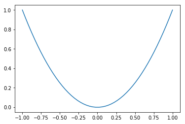
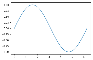
figure 图像
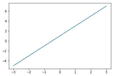
1 | x = np.linspace(-3, 3, 50) |
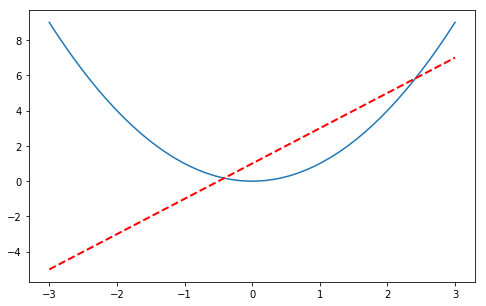
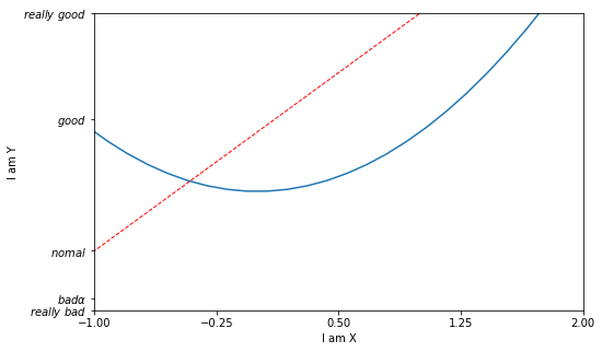
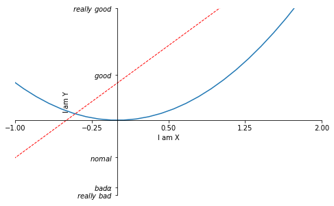
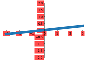
坐标轴设置
1 | x = np.linspace(-3, 3, 50) |
[-1. -0.25 0.5 1.25 2. ]
1 | x = np.linspace(-3, 3, 50) |
[-1. -0.25 0.5 1.25 2. ]
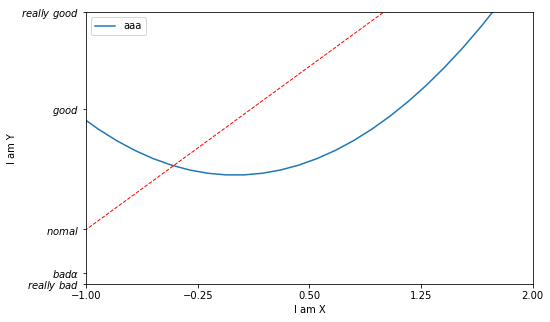
Legend 图例
1 | x = np.linspace(-3, 3, 50) |
[-1. -0.25 0.5 1.25 2. ]
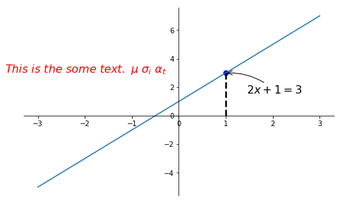
Annotation 标注
1 | x = np.linspace(-3, 3, 50) |
tick 能见度
1 | x = np.linspace(-3, 3, 50) |
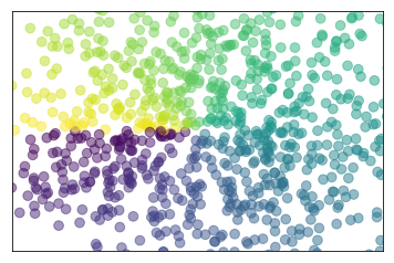
散点图
1 | n = 1024 |
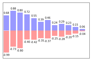
柱状图
1 | n = 12 |
contours 等高线图
1 | def f(x, y): |
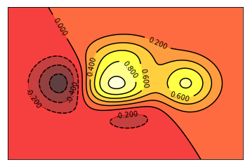
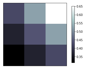
image 图片
1 | a = np.array([0.313660827978, 0.365348418405, 0.423733120134, |
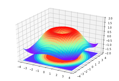
3D 数据
1 | from mpl_toolkits.mplot3d import Axes3D |
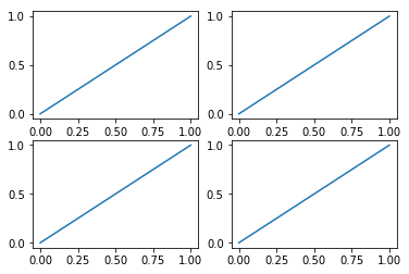
subplot 多合一显示
1 | plt.figure() |
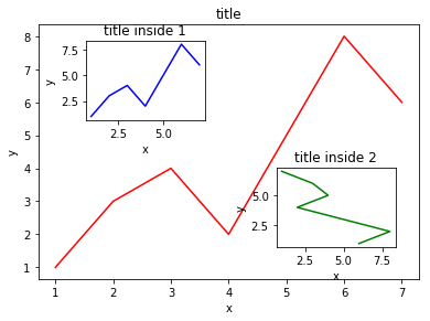
图中图
1 | fig = plt.figure() |
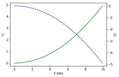
次坐标轴
1 | x = np.arange(0, 10, 0.1) |
animation 动画
1 | from matplotlib import animation |